The Challenge
Tranquini needed a campaign that could introduce the brand in a way that felt different from traditional energy or soft drink communication.
The challenge was to present Tranquini as a drink connected to calmness, positivity, and emotional balance while still making the message commercially effective.
The campaign also needed to work across different channels, from print to social media to display advertising.
The Objective
The campaign had two core objectives:
- Build awareness for Tranquini Adaptogen Drink
- Support sales through memorable and engaging communication
The message needed to make people notice the brand, understand its mood, and connect it to daily life situations.
The Campaign Idea
The idea was built around a simple human truth:
Modern life is exhausting.
People deal with stress, pressure, and everyday frustrations. Tranquini was positioned as a light and positive response to that reality.
Instead of using hard-selling language, the campaign used humor, relatability, and calm energy to make the brand feel approachable and relevant.
The line “Relax. Be positive. Good happens.” became the emotional anchor of the campaign.
My Role
I was involved in the creative development of the campaign.
My work contributed to shaping the communication direction, concept thinking, and content approach across campaign formats.
The focus was to create a message that felt simple, culturally relatable, and aligned with the Tranquini brand personality.
Creative Direction
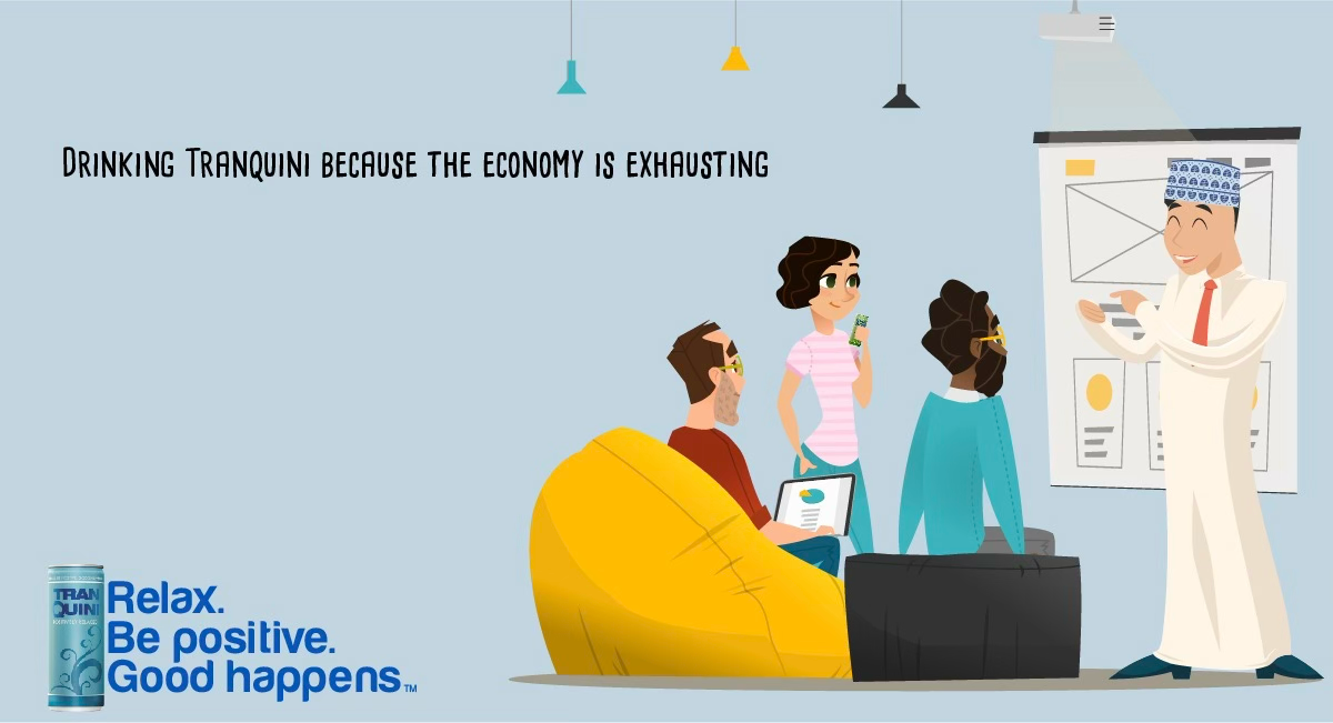
The campaign used a clean and friendly visual style with a light tone of voice.
The creative system focused on:
- Everyday stress-based situations
- Positive and relatable humor
- Clear product visibility
- Soft and calming brand colors
- Simple copy-led execution
- Flexible adaptation across print and digital formats
The artwork balanced a modern illustrated look with direct messaging, helping the campaign stand out without feeling heavy or overly corporate.
Communication Strategy
The campaign was designed to make Tranquini feel relevant in normal daily moments.
It connected the product with situations where people feel mentally drained, then presented the drink as part of a more relaxed and positive mindset.
This gave the brand a distinct position in the consumer’s mind.
It was not only about refreshment.
It was about mood.
Channel Execution
Print executions were designed to create strong awareness and communicate the message clearly at first glance.
The simple composition and readable copy made the campaign suitable for posters, placements, and static brand communication.
Meta
For Meta, the visuals were adapted to work in-feed and on mobile.
The campaign’s humor, simple copy, and clear product placement helped the content perform well in scroll environments while keeping the brand message easy to absorb.
GDN
For GDN, the concept translated into attention-grabbing digital banners with short copy and strong visual branding.
This allowed the campaign to support broader digital reach and repeated brand recall.
Brand Role
Tranquini was positioned as a drink that fits moments of stress and mental overload.
The campaign gave the brand a personality that felt:
- Calm
- Positive
- Light
- Modern
- Relatable
This helped create a more emotional connection than standard beverage advertising.
The Outcome
The final result was an integrated campaign system that could support both awareness and sales goals across print, Meta, and GDN.
It gave Tranquini a recognizable communication style and a platform that could extend into more social content and campaign themes.
Why This Project Matters
This project shows how a product can be positioned around emotional benefit, not only functional benefit.
The campaign used a simple truth, a clear tone of voice, and consistent visual language to make the brand feel memorable and relevant.
It turned everyday pressure into a brand conversation that was easy to understand and easy to share.